The Weather Channel Apps

With hundreds of millions of users, The Weather Channel app has a staggering reach. I was hired at TWC as its first dedicated mobile designer in 2011, and over the next five years I led the visual design and user experience for the company’s mobile applications.

Context

The Weather Channel’s mobile apps were the company’s largest touchpoint, reaching hundreds of millions of people who needed fast, trustworthy answers about the weather around them. The following work illustrates the the 2016 redesign I did for The Weather Channel mobile apps - most of the design and UX is still in place.

Goal

Rethink the flagship app for 2016: a fresh, flat visual language and a feed-style experience that surfaces the three things most pertinent to the user based on location and current conditions.

Rethink the flagship app for 2016: a fresh, flat visual language and a feed-style experience that surfaces the three things most pertinent to the user based on location and current conditions.

What I worked on

What I contributed

Product strategy, art direction, UX and UI design lead across iOS, Android and Apple Watch applications.

Designed for

The Weather Channel

Role

Design Lead, Mobile

Platforms

iOS

Android

Watch

Timeline

5 Years

Team

Myself, Design Team, PM, Engineering

Myself, Project Manager, 3 Developers, Client Stakeholders

Reimagining the UX

Back to Wireframes

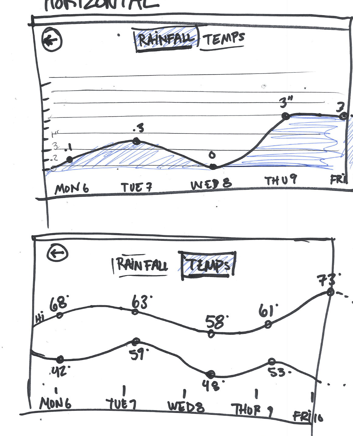
Before any pixels were polished, we went back to wireframes. Sketching and low-fidelity flows let us question every assumption about the old app — how conditions, hourly, radar and video should be prioritized, and how a feed could adapt to location and weather. Rapid rounds of wireframes, app maps and user flows gave the team a shared model of the experience and made it cheap to test big structural ideas before committing to visual design.

Before any pixels were polished, we went back to wireframes. Sketching and low-fidelity flows let us question every assumption about the old app — how conditions, hourly, radar and video should be prioritized, and how a feed could adapt to location and weather. Rapid rounds of wireframes, app maps and user flows gave the team a shared model of the experience and made it cheap to test big structural ideas before committing to visual design.

Mood and Art Direction

Look & Feel

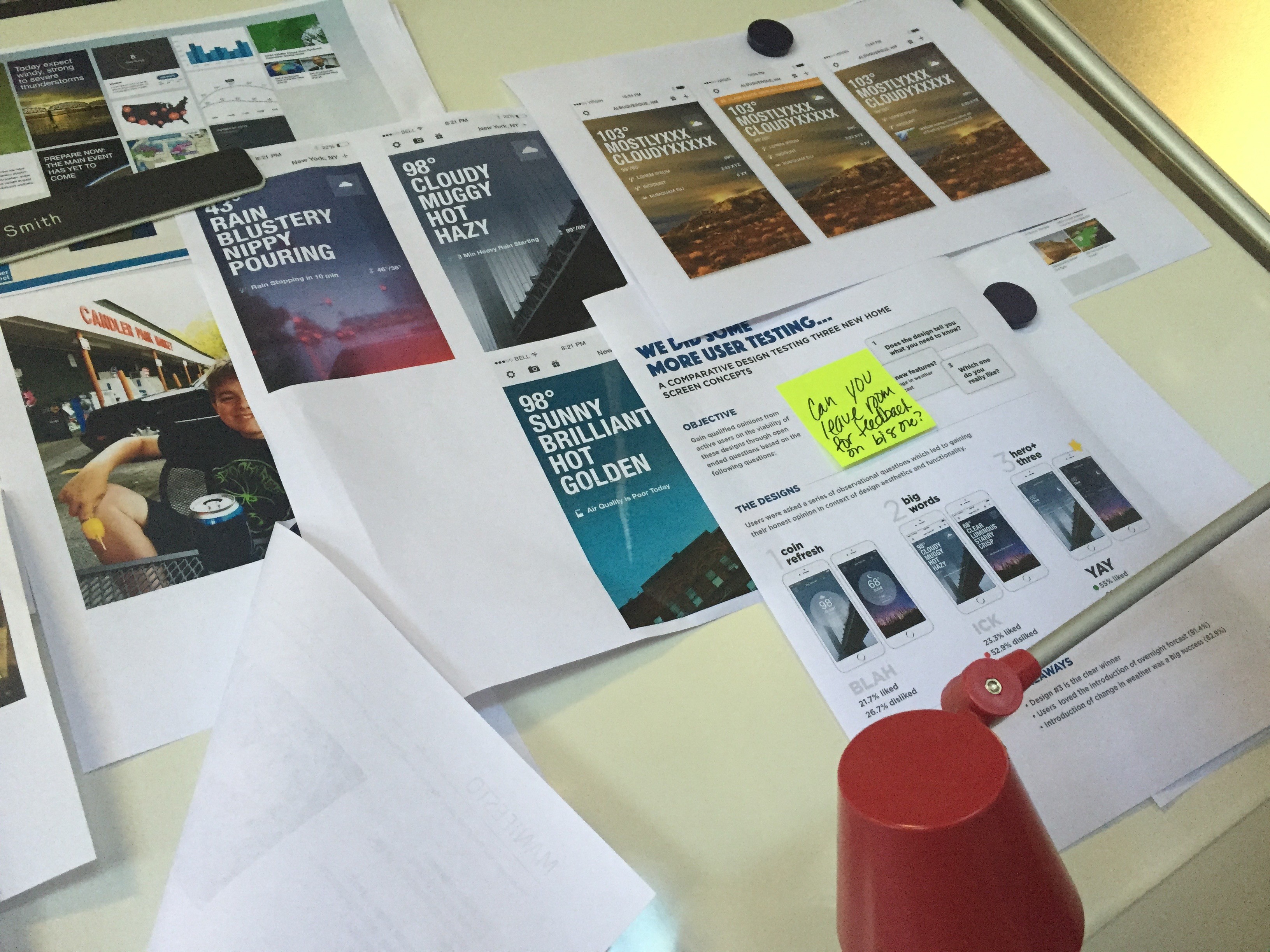
With the structure settled, art direction defined the feeling of the app: evocative location-based photography, bold condition-driven color, strong iconography and flat graphics that let temperature and conditions read instantly. Mood boards, print explorations and on-device studies helped us agree on the tone before a single screen was finalized.

Visual Design

Designing the Final Screens

Keeping the successful location-based photography and feed-style UX from the previous iteration, I gave the app a fresh, flat new look and feel. The homescreen shows the three things most pertinent to the user based on location and weather condition.

Other Components

Run Weather Index

The Run Weather Index gives the user a snapshot of the best times to run, and IBM’s Watson AI was integrated into the app to power more conversational, personalized forecasts.

Other Components

Run Weather Index

The Run Weather Index gives the user a snapshot of the best times to run, and IBM’s Watson AI was integrated into the app to power more conversational, personalized forecasts.

Platform Variations

Platform Variations

Platform Variations

Integrating IBM’s Watson AI

Integrating IBM’s Watson AI

First Apple Watch App

First Apple Watch App