Gozio Appointment Booking

Designing a streamlined, user-friendly native experience for booking quick, urgent, and primary care appointments.

Designing a loan repayment app for the top student lender.

Context

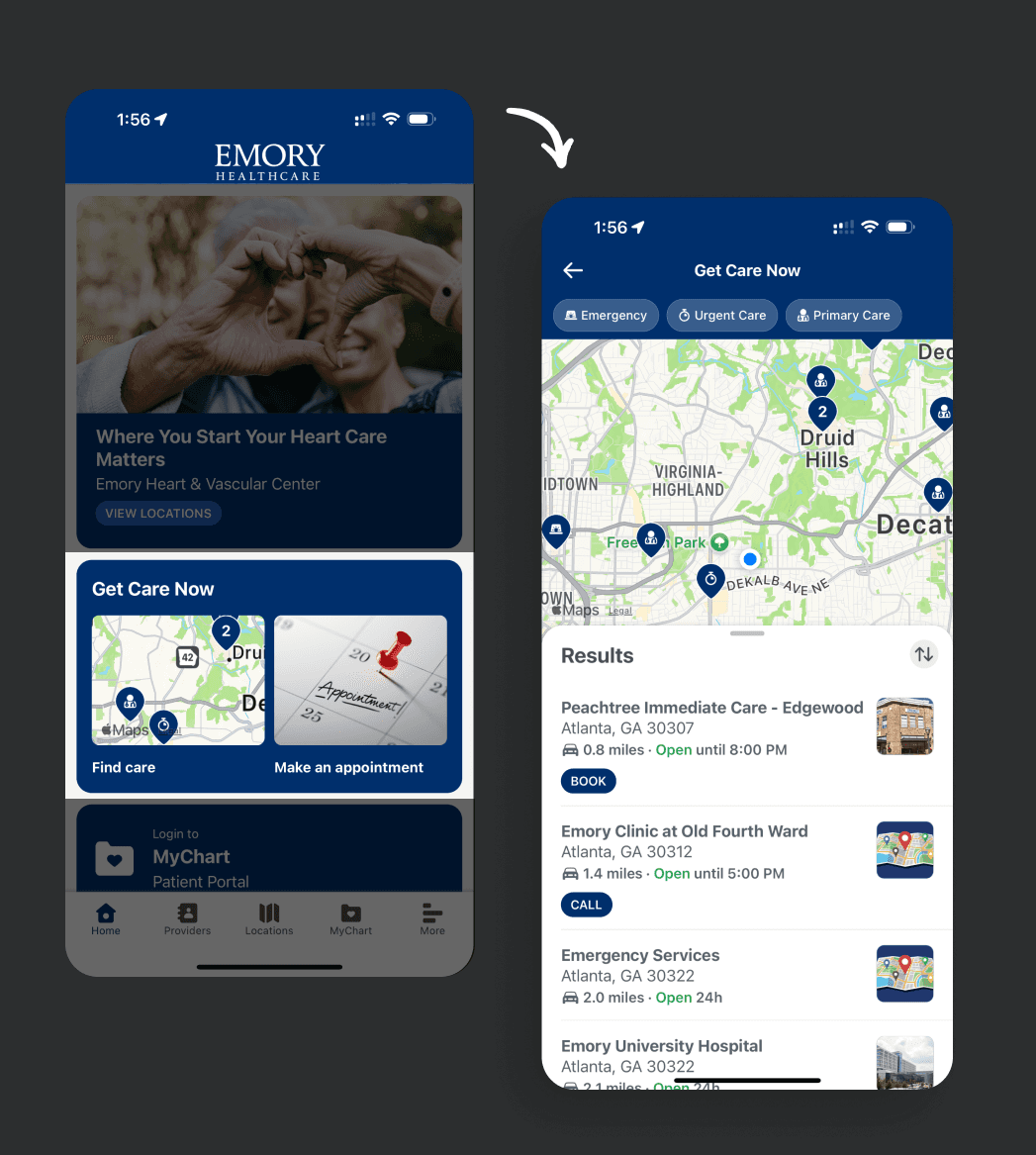
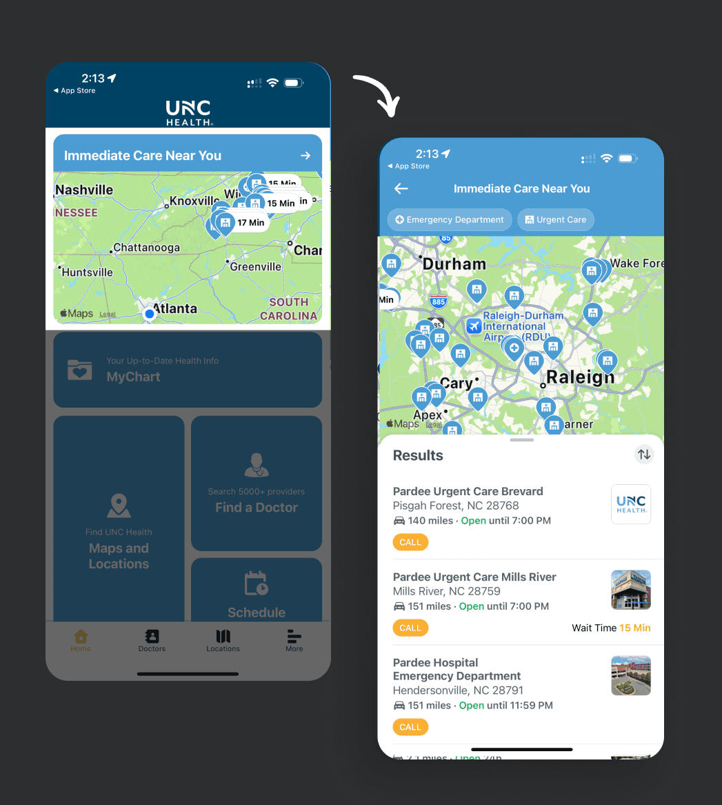
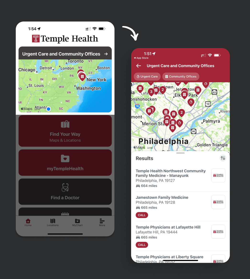
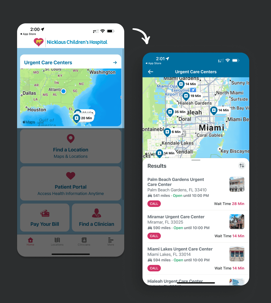
Urgent and quick care are critical access points for healthcare systems to engage new patients. Individuals seek these services for conditions that aren’t serious enough for the ER but can’t wait for a routine appointment. When a patient doesn’t have an established provider, this presents a valuable opportunity for Gozio’s clients to initiate that relationship and build long-term continuity of care.

Goal

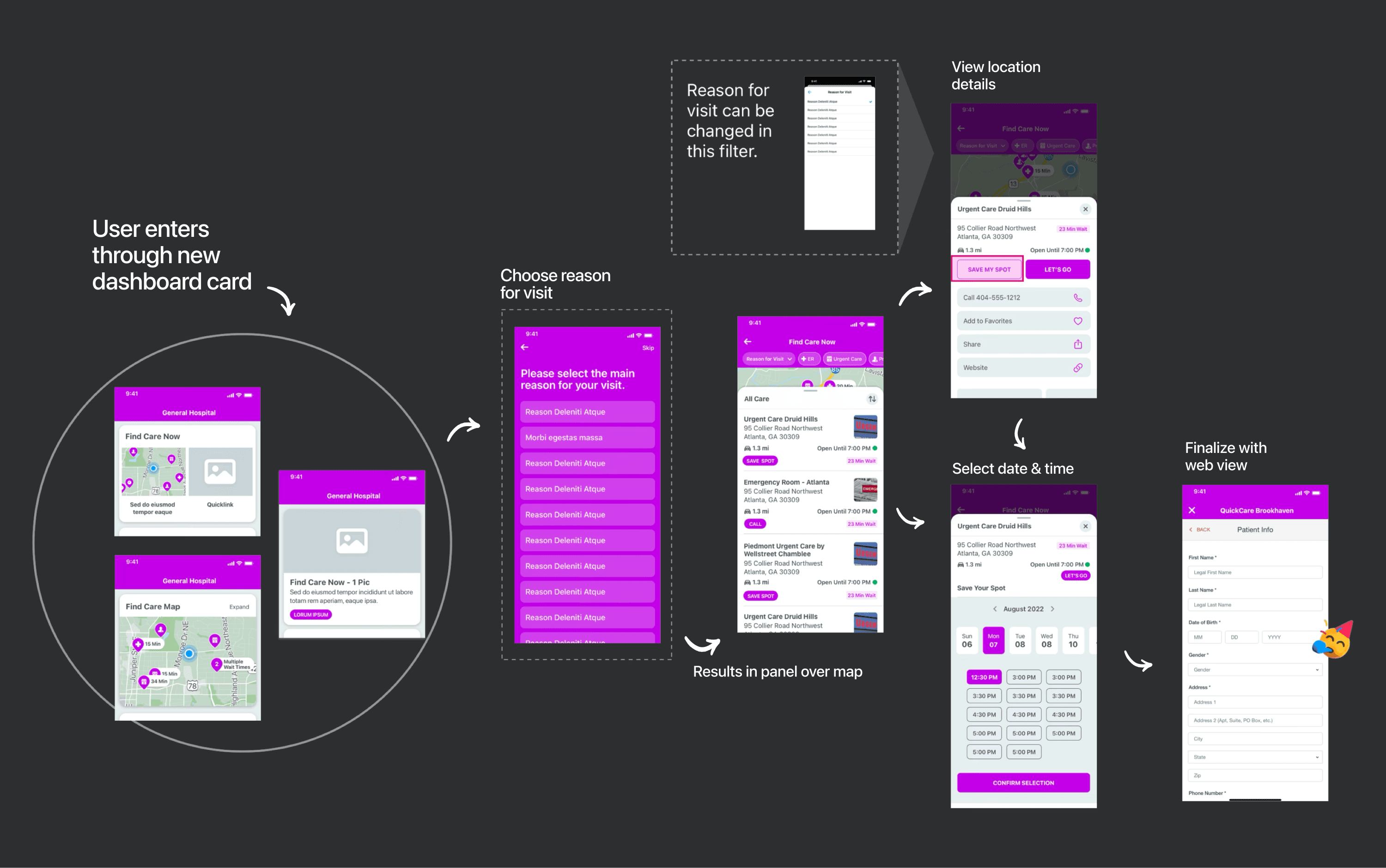
The goal of this redesign was to create a seamless, intuitive experience that helps users quickly filter and choose care locations based on need, availability, proximity, and shortest wait times.

Evaluation

The legacy experience was outdated, lacking modern search patterns and filtering capabilities. Much of the flow relied on web views, leading to visual inconsistencies and a fragmented user experience.

Insights

  • An accordion dropdown was cumbersome and obscured content below.

  • Lacked intuitive filtering by need, availability, proximity, and wait time —essential for a smooth user experience.

  • Several non-native views led to a fragmented experience.

  • Minimal ability for clients to customize the experience.

  • Disconnected from the map, disrupting context

Mapping a Better Flow

The legacy experience was outdated, lacking modern search patterns and filtering capabilities. Much of the flow relied on web views, leading to visual inconsistencies and a fragmented user experience.

The legacy experience was outdated, lacking modern search patterns and filtering capabilities. Much of the flow relied on web views, leading to visual inconsistencies and a fragmented user experience.

Mapping a Better Flow

  • By creating 3 different dashboard cards to select from, we gave the client more choice in presenting their offerings.

  • Establishing the reason for visit at the beginning of the flow helped narrow the results and saved time on data calls.

  • Placing the results in a panel that floats above a map gives location context while filters allow user to adjust the search.

Mapping a Better Flow

The legacy experience was outdated, lacking modern search patterns and filtering capabilities. Much of the flow relied on web views, leading to visual inconsistencies and a fragmented user experience.

Mapping a Better Flow

  • By creating 3 different dashboard cards to select from, we gave the client more choice in presenting their offerings.

  • Establishing the reason for visit at the beginning of the flow helped narrow the results and saved time on data calls.

  • Placing the results in a panel that floats above a map gives location context while filters allow user to adjust the search.

User Testing

Dashboard Cards

Using Maze, I created a few user tests in able to make better suggestions to clients when they are choosing a dashboard card.

User Testing

Dashboard Cards

Using Maze, I created a few user tests in able to make better suggestions to clients when they are choosing a dashboard card.

Final Design

Appointment Booking in Use

Emory Health

UNC Health

Temple Health

Nicklaus Children's Hospital

Final Design

Appointment Booking in Use

Emory Health

UNC Health

Temple Health

Nicklaus Children's Hospital

Outcome

The new booking flow is now used by many of Gozio's hospital clients. One client (Piedmont Healthcare in Atlanta) said the following:

"PiedmontNow analytics reveal an impressive conversion rate from click to fulfillment of appointment at thirty percent (30%). Online scheduling also reflects a significant increase in new patients to the Piedmont system. Twenty-six percent (26%) of all online scheduled patients are new to Piedmont including QuickCare, which jumps to 39% of new patients through mobile and online scheduling."