eMeals App

Meal planning made easy and affordable. eMeals customers select meals from a large weekly selection of 15 different eating styles, while the app organizes ingredients and sends the shopping list to the grocer and delivery service of their choice.

Context

eMeals is a subscription meal-planning service. Members choose an eating style at sign-up, but once inside the app they only ever saw that one style — hiding the vast majority of the content they were paying for.

Goal

Rewire the experience so the breadth of content is obvious, adding meals to the cart is effortless, and the product feels personal, modern and in step with its audience.

Rewire the experience so the breadth of content is obvious, adding meals to the cart is effortless, and the product feels personal, modern and in step with its audience.

What I worked on

What I contributed

Heuristic evaluation, user feedback analysis, information architecture, wireframing, onboarding design, UX and UI design across mobile and web.

Designed for

eMeals

Role

Lead Product Designer

Platforms

iOS

Android

Web

Timeline

8 Months

Team

Myself, PM, Engineering

Myself, Project Manager, 3 Developers, Client Stakeholders

Re-Wiring the App

Assessing the User Experience

A heuristic evaluation, call-center feedback and behavioral data surfaced four clear problems: members never saw the other 14 eating styles, so the offering felt sparse; adding meals to the cart was laborious; there was almost no personalization; and the voice and visual language felt clinical and dated. Re-wiring the information architecture and flows addressed each one.

A heuristic evaluation, call-center feedback and behavioral data surfaced four clear problems: members never saw the other 14 eating styles, so the offering felt sparse; adding meals to the cart was laborious; there was almost no personalization; and the voice and visual language felt clinical and dated. Re-wiring the information architecture and flows addressed each one.

A New Onboarding Experience

First Time User Experience

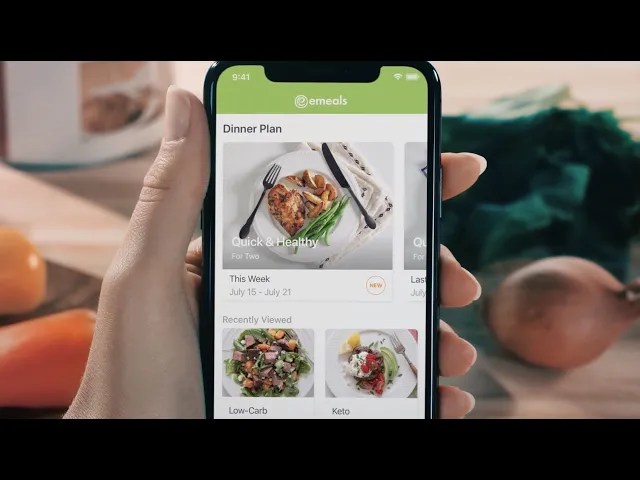
A guided first-run flow introduces the full library of eating styles, captures a few preferences and gets members to their first meal plan quickly — replacing the old dead end where people had to call support to switch styles.

Final Visual Design

Look, Feel & Voice

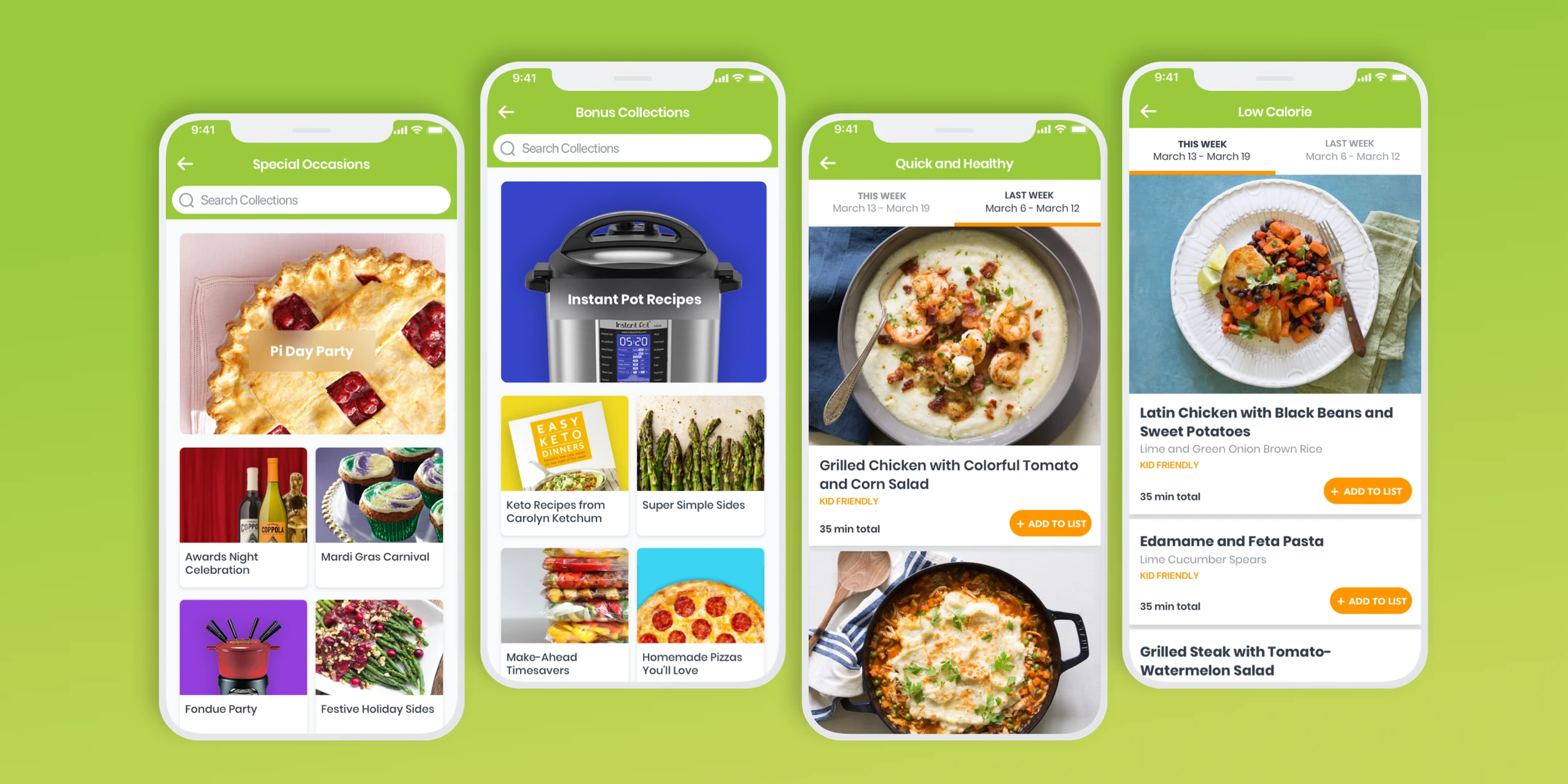
Big appetizing food photography, clearer typography and a warmer, more conversational voice replaced the clinical original. Browsing now leads with the meals themselves, and adding a week of dinners to the cart takes a couple of taps.

Final Visual Design

Look, Feel & Voice

Big appetizing food photography, clearer typography and a warmer, more conversational voice replaced the clinical original. Browsing now leads with the meals themselves, and adding a week of dinners to the cart takes a couple of taps.

Web

Web

Weight Watchers Integration

Weight Watchers Integration